My Palette
I use a Jack Richeson Porcelain Palette designed by Stephen Quiller. I love it because it has twenty-four main wells, exactly the number of colors I have chosen for my collection. It also has eight corner wells, which I use for white and blacks. The palette design is beautiful, and what could be better than pure white porcelain for watercolor painting? I do not use the Quiller Color Wheel, even though it was created by the same clever man who designed the palette.
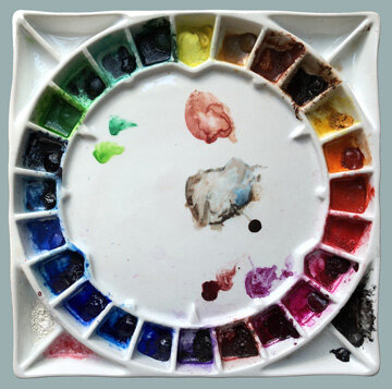
Jack Richeson/Stephen Quiller Palette
Instead, I use a modified version of the color system in the book Watercolour Painting: A Complete Guide to Techniques and Materials by Jean-Louis Morelle. His 31-color palette is set up in the shape of a triangle. This setup is intended to communicate Morelle’s ideas, not to suggest that you should buy an actual triangle-shaped palette. (Okay, I did try to find one!)
If you want a more limited palette (and who doesn’t!), you can use Morelle’s ideas to set up palettes with fewer numbers of colors. As stated above, twenty-four is my perfect number, enough separate pigments to keep mixing to a minimum, but not so many that the process of selecting colors gets out of hand. Here is my list of twenty-four colors, including the brands I currently use.

So which of Morelle’s ideas did I use to come up with this list of colors? And how did I arrange them on my round palette? Those questions will be answered in a future post.